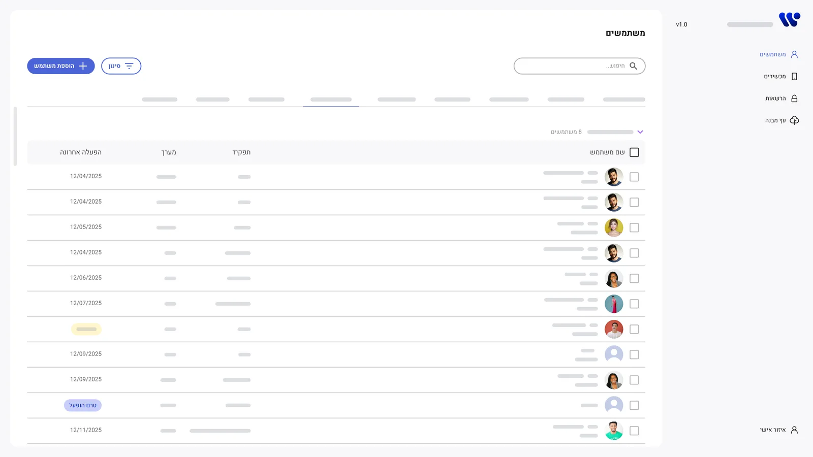
Overview
This is the admin system behind the products in my design system case study. Admins use it every day for three things: finding a device, finding a person, and creating new users.
When the need for a redesign came up, there was no product manager on the project. So beyond designing it, I led the product: I talked to the admins, defined what the new version had to do, and worked directly with the developers to ship it.
These are the real screens from the project. Names, units, roles and identifiers are hidden behind grey bars for confidentiality. Click any screen to see it larger.
The problem
The old system tried to show everything at once. Every device, every unit, every technical detail, all in one table.
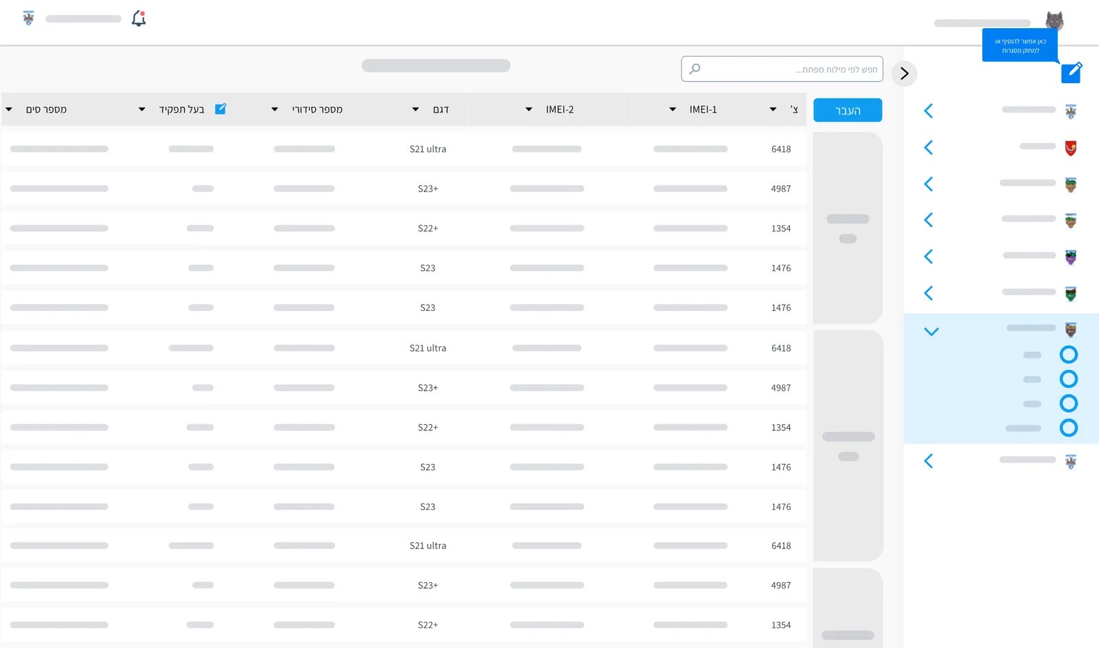
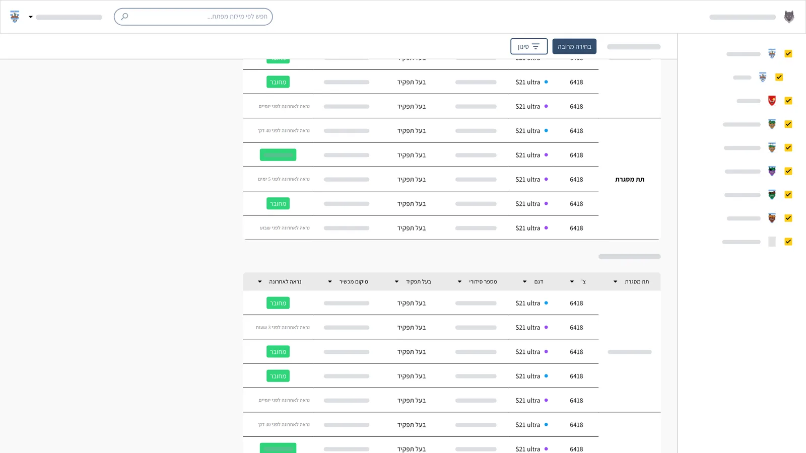
- Finding something took too long. To find one device or one person, admins scrolled through unit after unit.
- Managing users was complex. Users and devices lived apart, with nothing connecting a person to their devices, so even simple questions needed detective work.
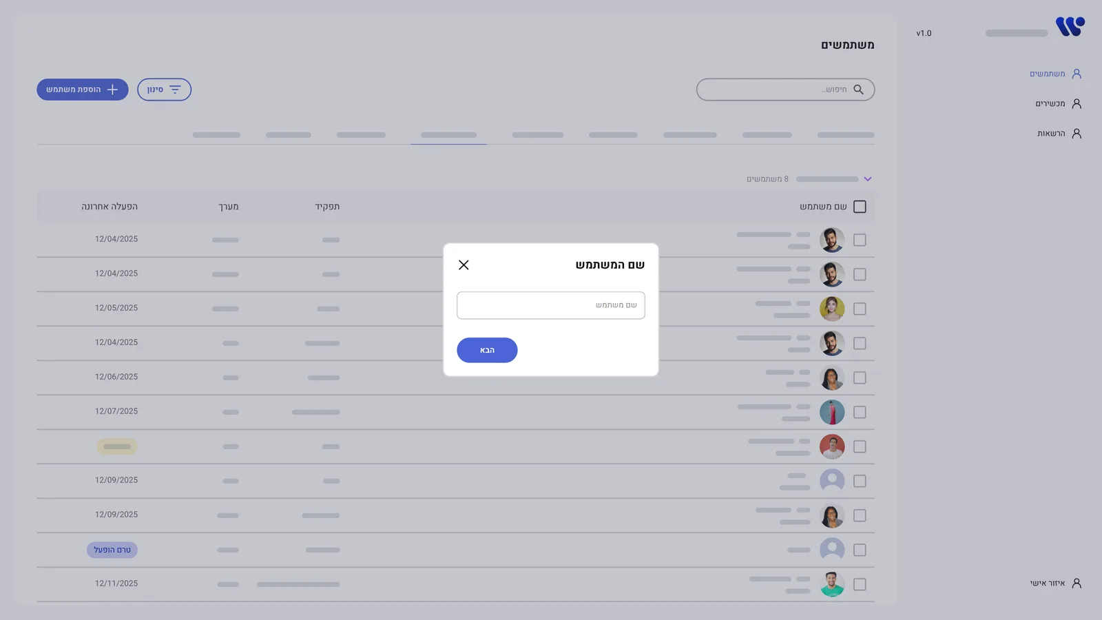
- Creating users took too long. Creating, editing and permissioning users took too many steps and wasn't designed as a flow of its own.
Listening to admins
Instead of guessing, I sat with the people who use the system and asked two questions: what do you look at every single time, and what do you only need once you've found the right row? Their answers split the old table in two.
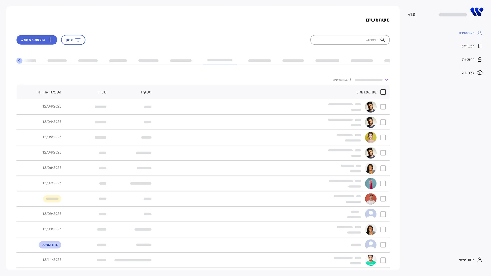
Stays in the table
What admins scan for, every time.
- Name
- Role
- Team
- Last active
Moves to the side card
What they need once they have found the right row.
- Permissions per product
- Connected phone and computer
- Edit and delete
- Full profile
The table is for finding. The card is for knowing.
The new structure
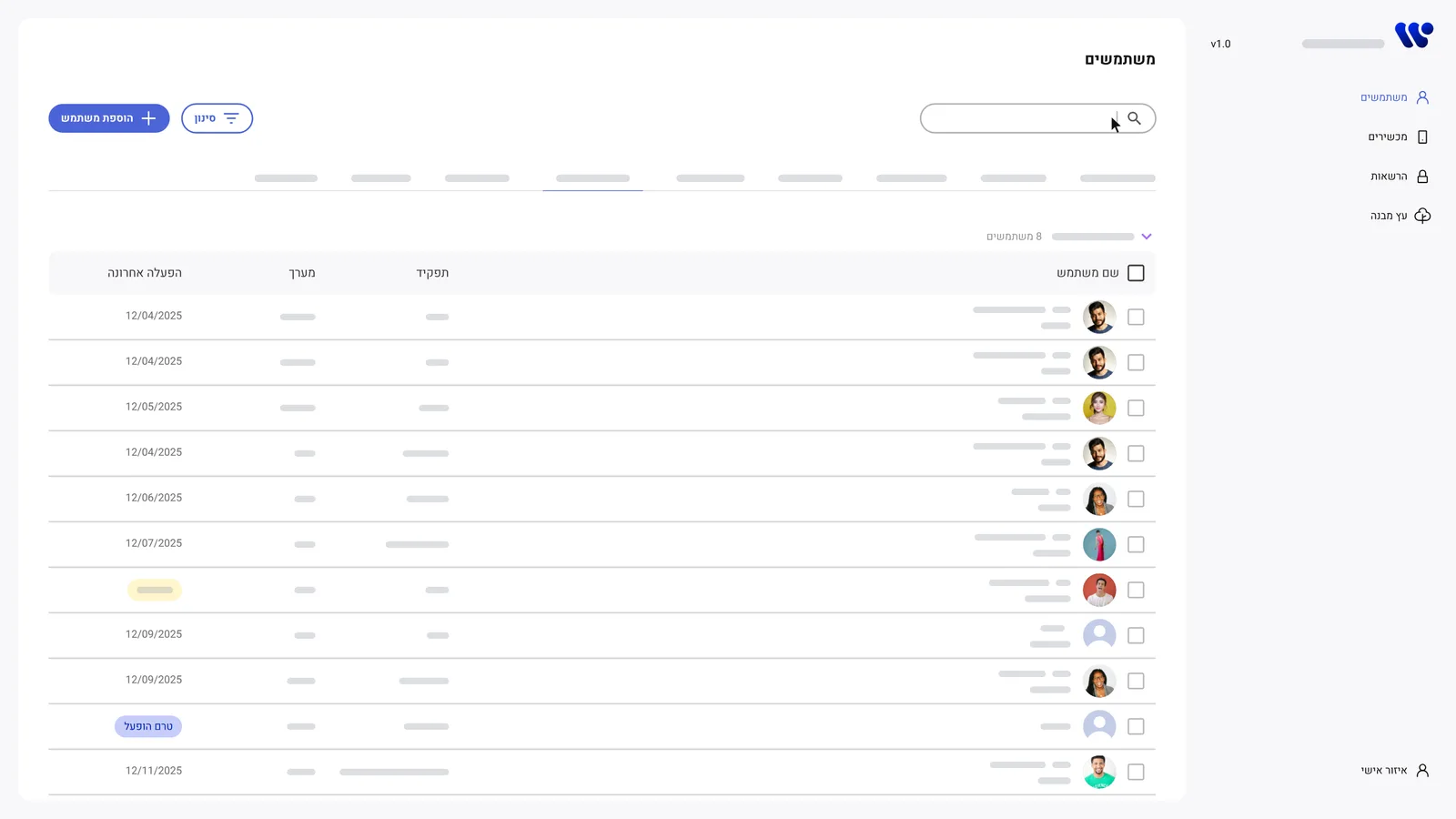
The new main screen is built around search. Four columns fit the screen without sideways scrolling, units became tabs instead of one long list, and paging replaced the endless scroll.
The detail card
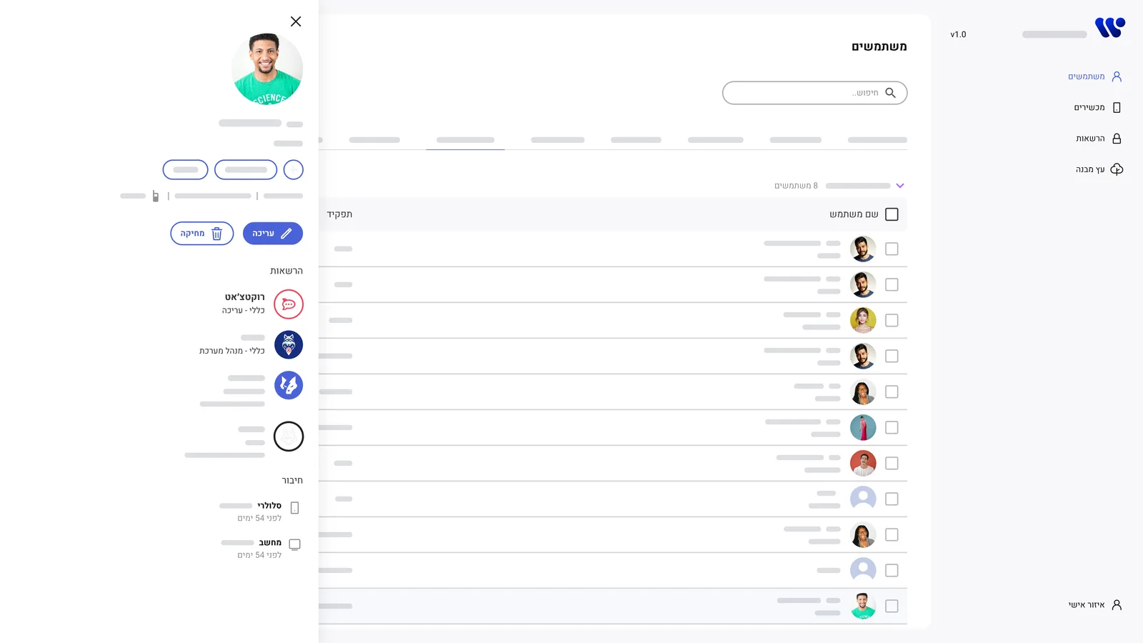
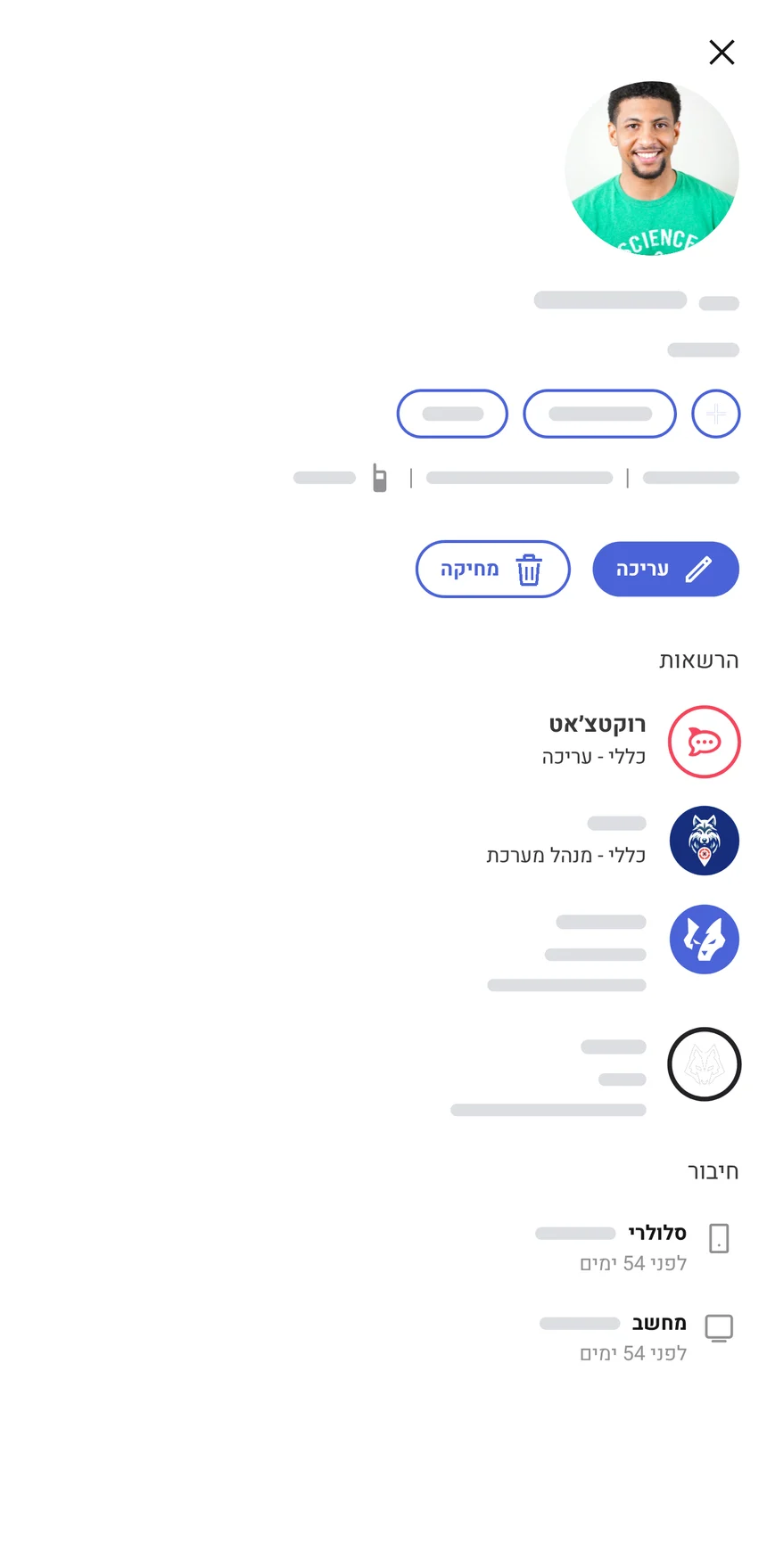
Click a row and a card slides in from the side. The table stays in view, so admins never lose their place, and everything that used to crowd the table lives here.
 1234
1234- Who this is Photo, name, role and team at the top, so admins know they opened the right person.
- Actions Edit and delete sit right under the profile, where the decision is made.
- Permissions per product Every system this person can access, and at what level, in one list.
- Connected devices The phone and computer linked to this person, and when each one last connected. This is what sync made possible.
Users, devices and sync
The biggest structural change was connecting people and devices. Admins can switch between a users view and a devices view, and each one leads to the other: open a person and see their devices, open a device and see who it belongs to.
We also added a sync option for mobile phones, computers and users. It's what makes the card possible: each person's phone and computer show up right inside their profile, with the time they last connected.
Everyday flows
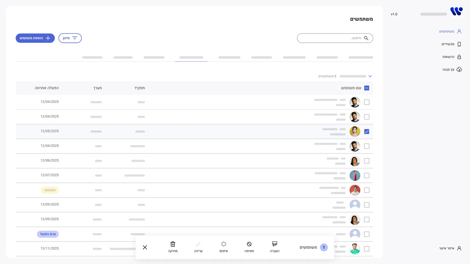
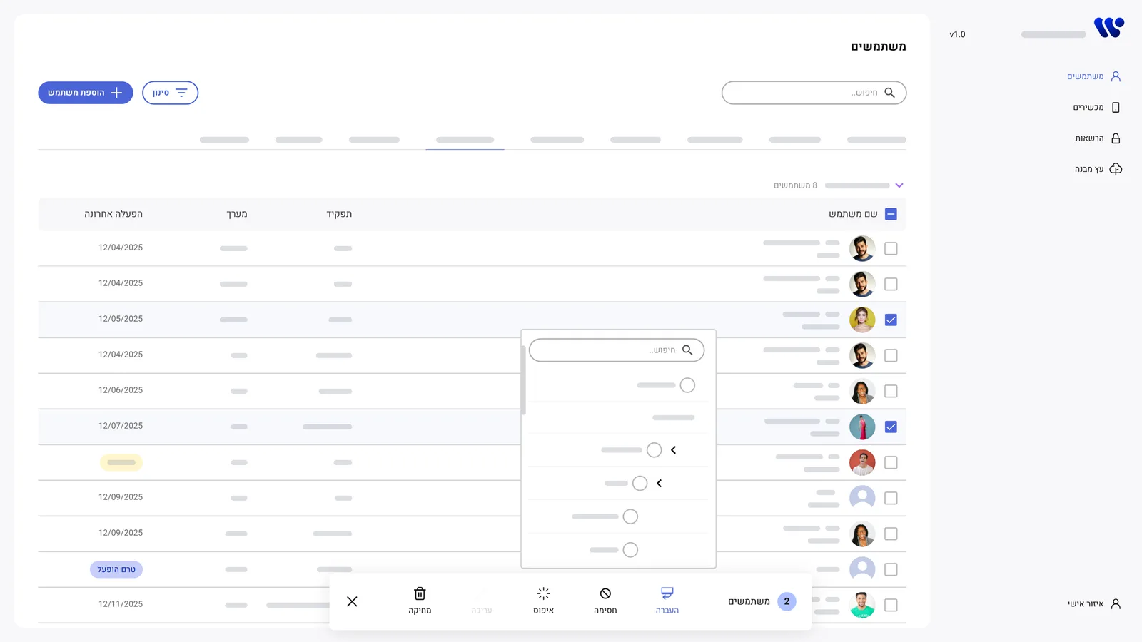
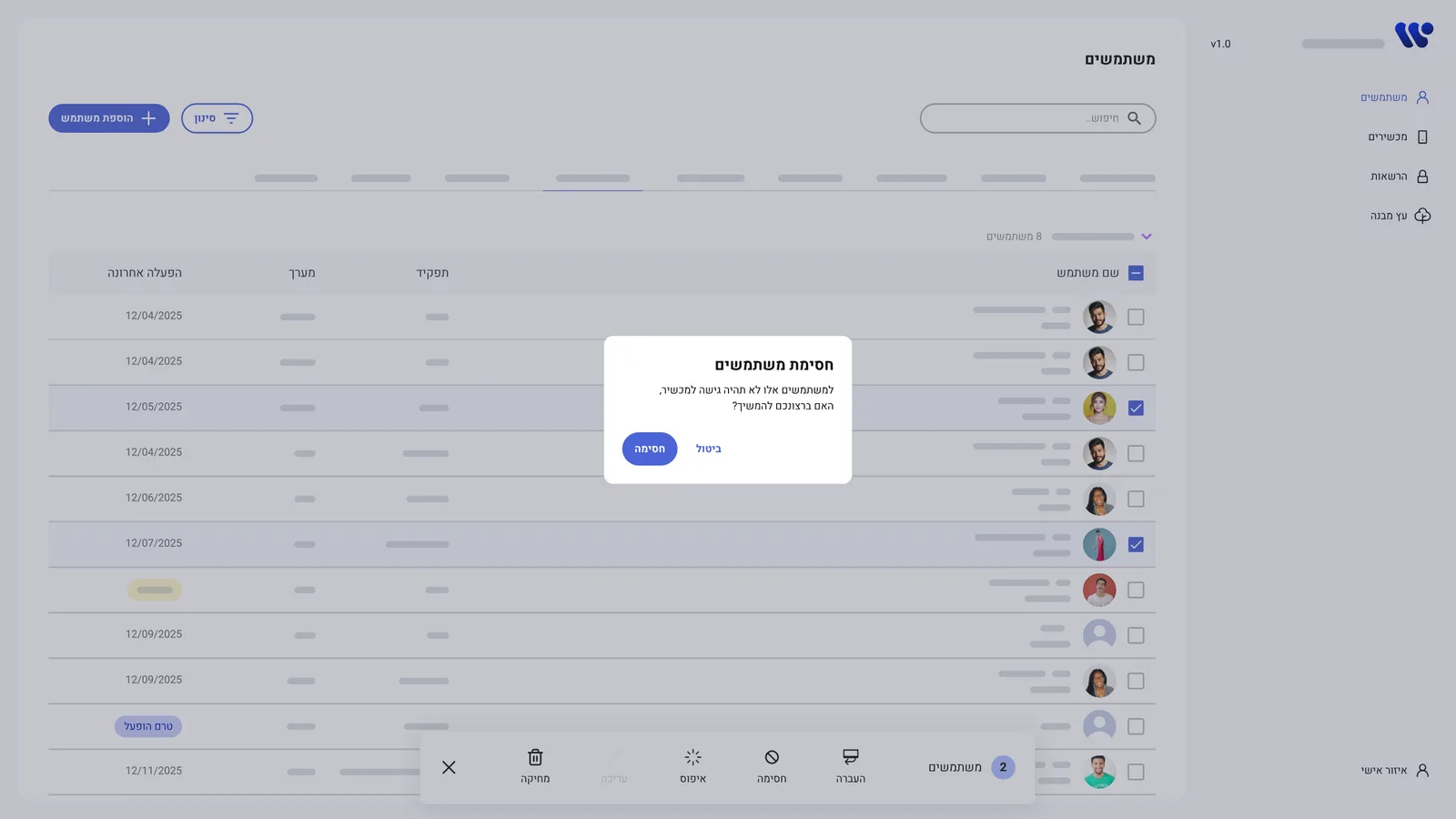
Beyond the main screen, I designed each of the daily tasks as its own short flow.
When things go wrong
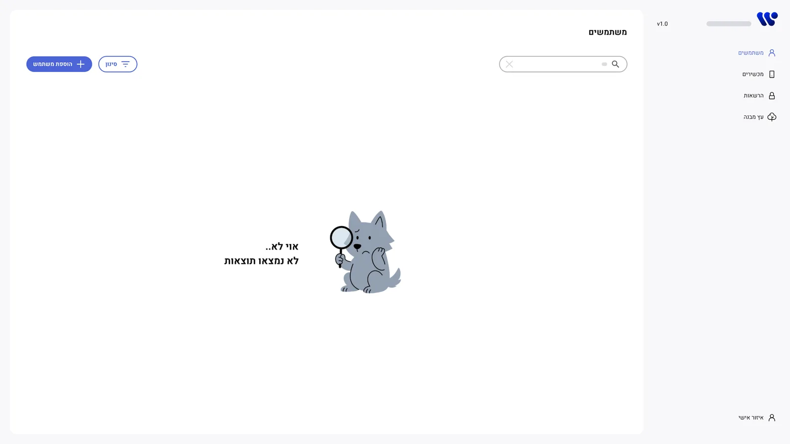
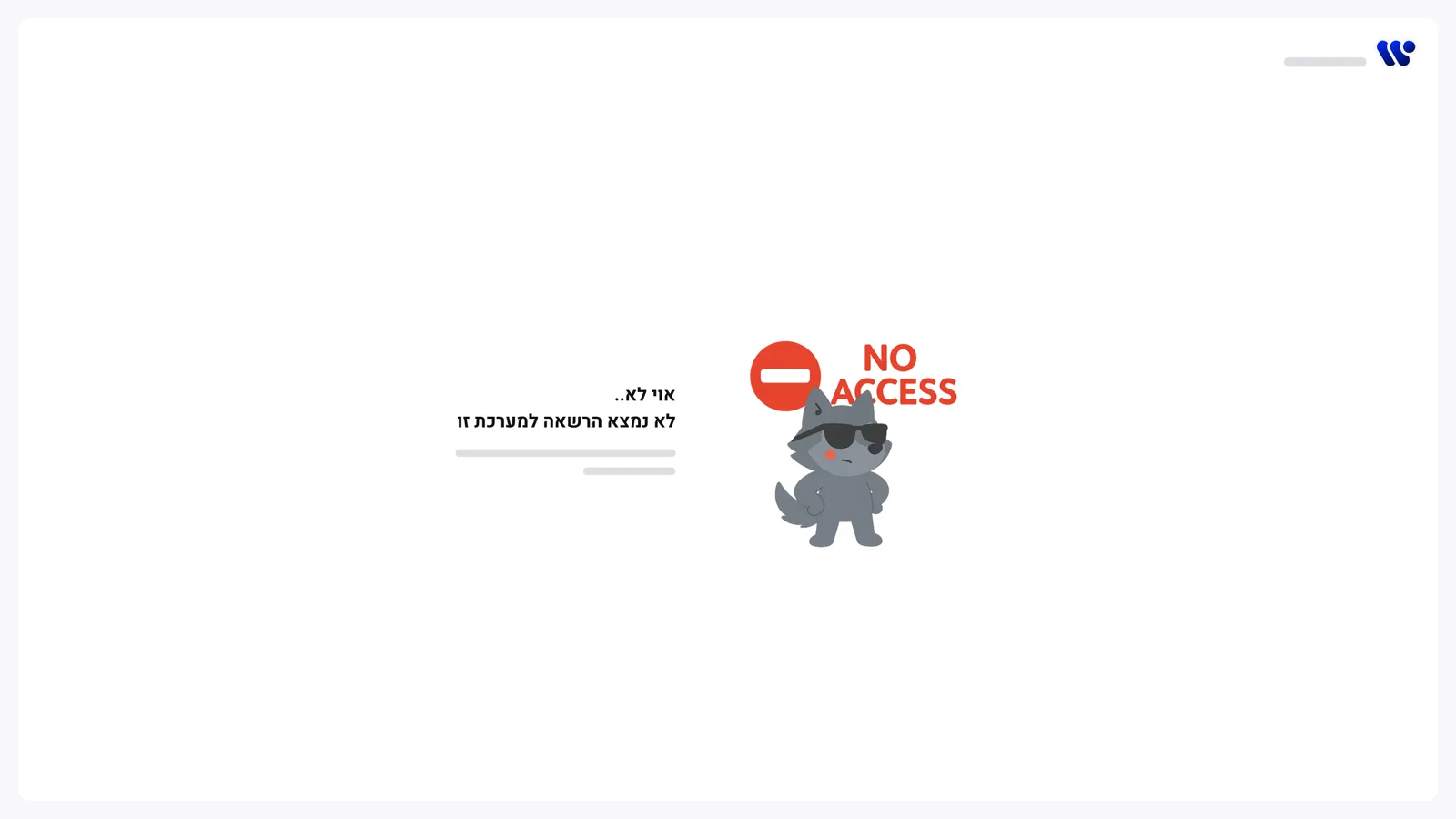
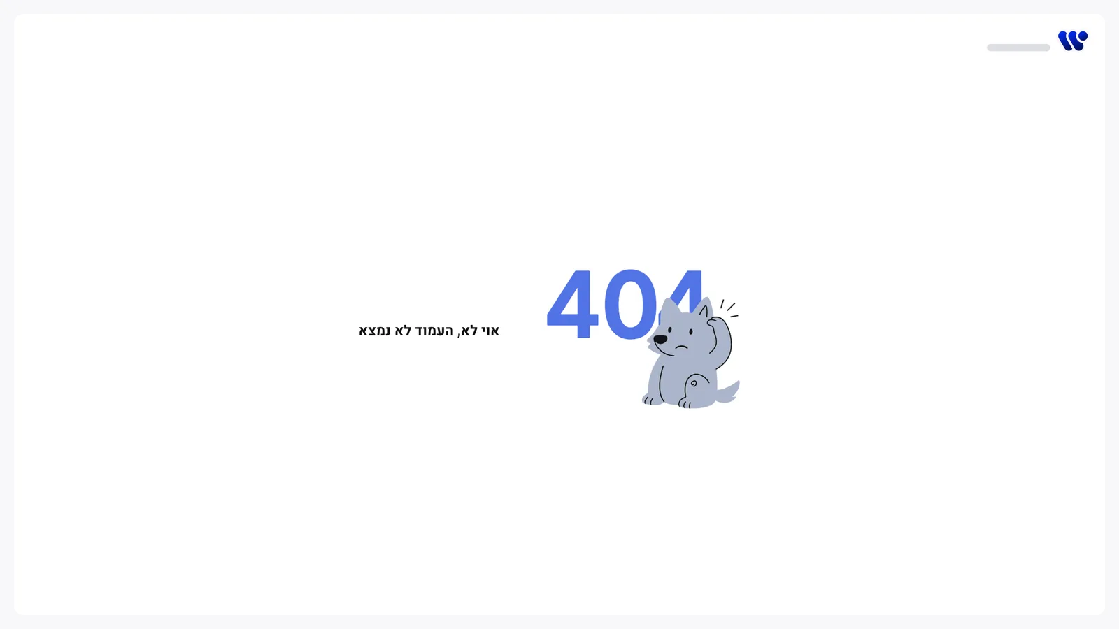
Admin tools rarely get love in their error states. I wanted every dead end to feel calm and point to a next step, so the same wolf mascot from the brand shows up when something is missing.
- Built on the design system. Tables, cards, pop-ups, inputs and buttons all come from the shared library.
- Right-to-left first. The interface is in Hebrew, so every layout was designed and tested right to left.
Outcome
One overwhelming table became a tool built around the three things admins actually do. The table fits on the screen, people and devices are connected, and every task starts from search.
What I learned
- Less on the screen can mean more for the user. Moving data to a card made it easier to reach, not harder.
- Leading without a title. Without a product manager, talking to users kept every decision grounded in what they actually needed.
- Admin tools deserve design too. Internal tools are used all day, every day, so small improvements add up fast.