Overview
The form is filled in by the senior caregiver on the scene, or someone on their behalf: a doctor, a paramedic or a medic. They are treating a casualty at the same time, often under pressure and with gloves on, so every extra tap and every hard-to-hit button costs time.
What they report reaches the medical control room and the hospitals, which use it to understand what's coming and get ready. I worked on the mobile form and the web views together, alongside the product manager, so both sides of the flow would tell the same story.
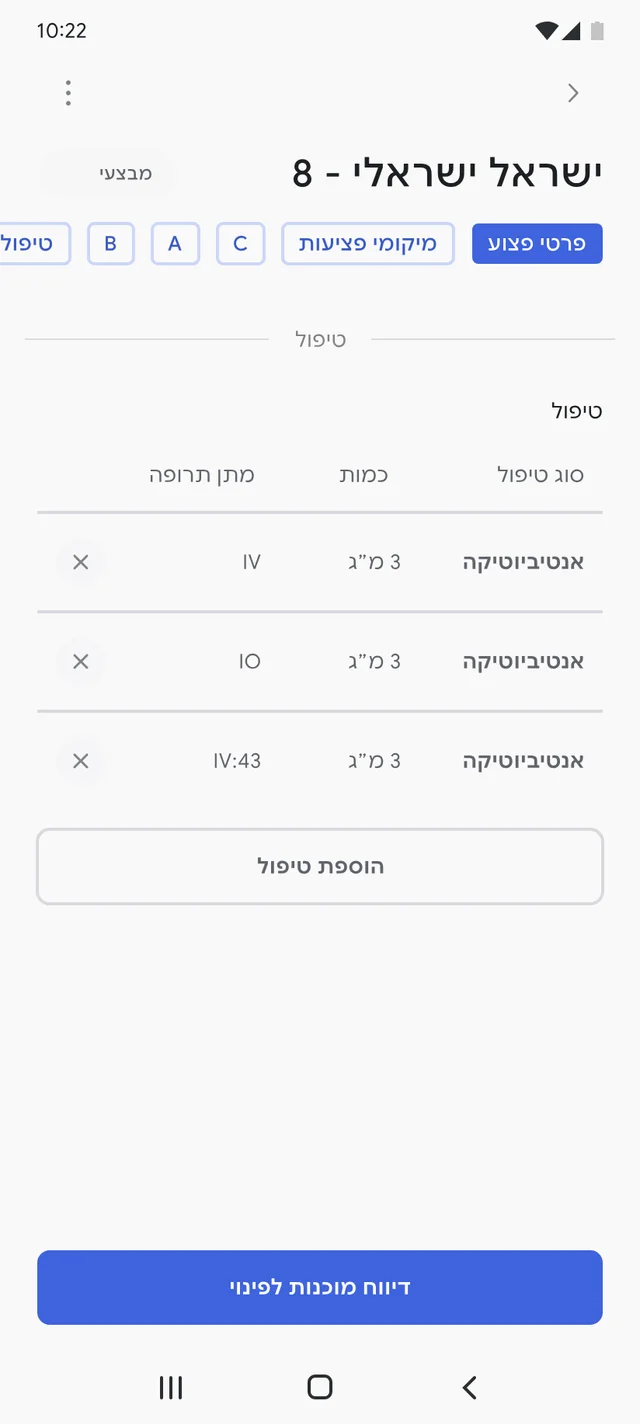
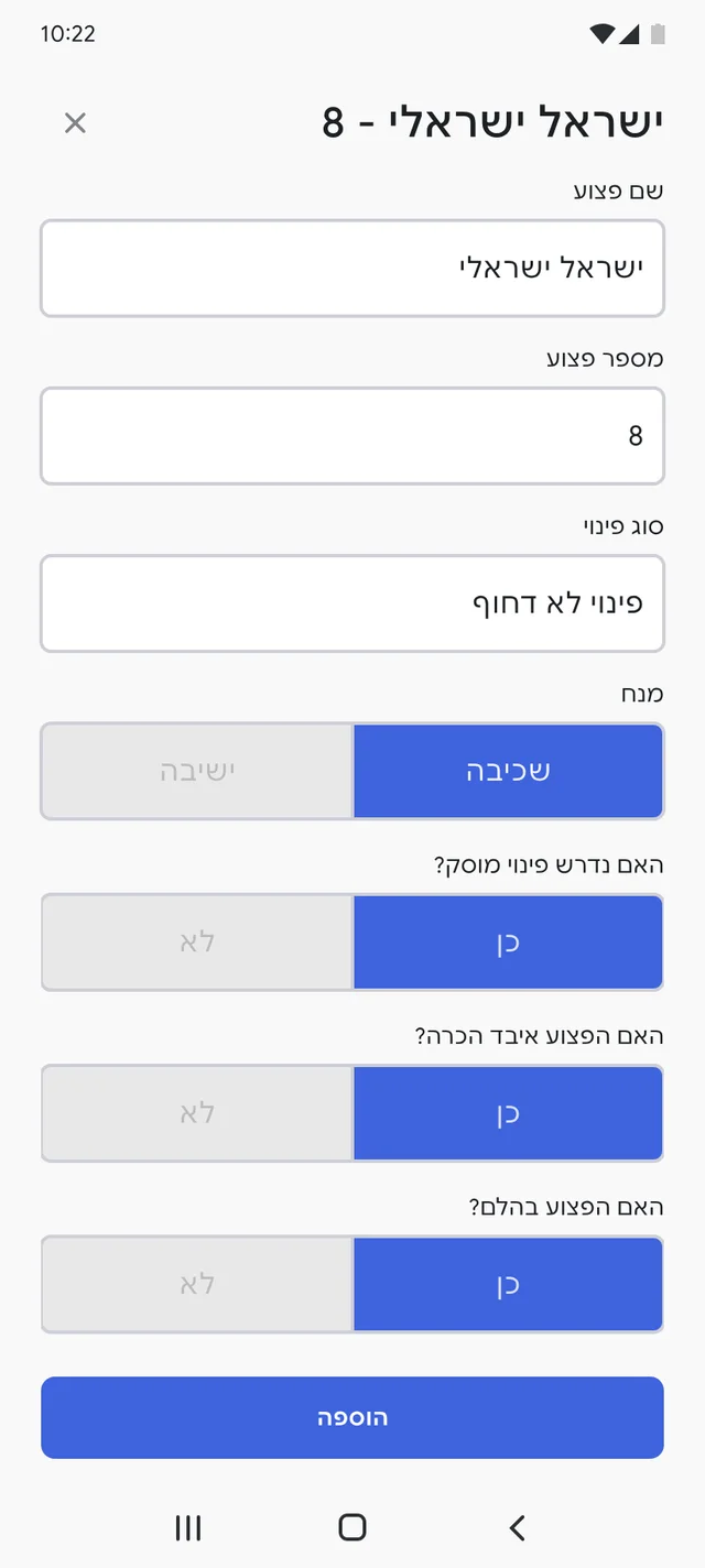
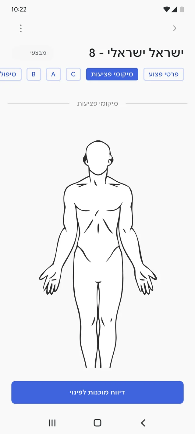
These are the real screens. Personal details are placeholders like "ישראל ישראלי", and unit names are hidden for confidentiality. Click any screen to see it larger.
The problem
The old app worked, but it fought its users. Button sizes changed from screen to screen, and options were stacked in long vertical runs that turned the form into a long, tiring scroll.
Before and after
The form follows the stages medics are trained on, from the casualty's details through A, B and C to treatment and evacuation. Pick a stage to compare the old screen with the new one.
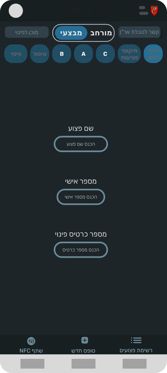
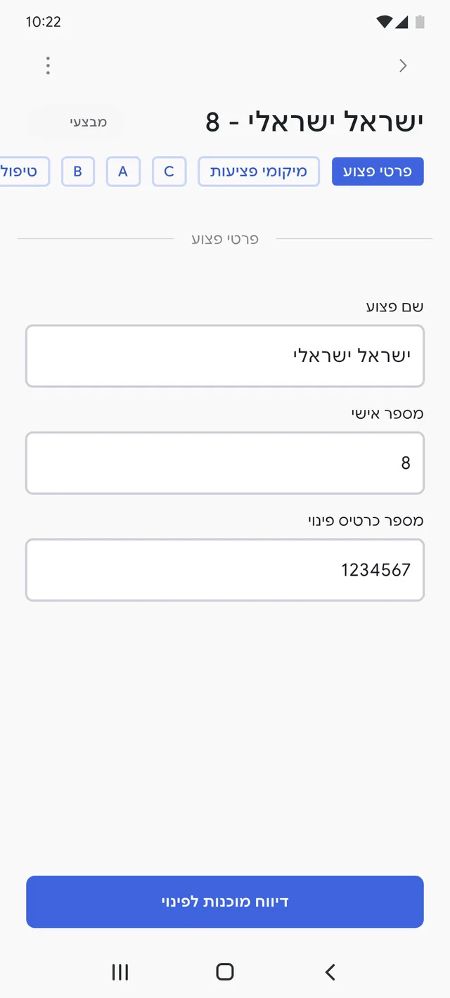
Clear labels above large, light fields. Stage tabs at the top show where you are in the form.
What changed
- Options scroll sideways, not down. Instead of long vertical runs of choices, related options sit in a row you can swipe. The form gets shorter and the important fields stay close together.
- One way to choose. Every choice uses the same buttons and states, so a medic learns the pattern once and reuses it everywhere.
- A clear map of the form. The stages are tabs at the top. Medics can scroll through the form, or tap a stage to jump straight to it, like C or back to the details.
- A lighter interface. Clear labels above each field and a stronger hierarchy between questions and answers.
Designed for gloves
Medics wear gloves while they treat, and gloves make fingers less precise. Every interactive element in the new form is at least 48 pixels tall, with spacing between neighbors so a tap lands where it was meant to.
הכרת הפצוע
האם קיימת פגישה בנתיב אוויר?
- 48px minimum for buttons, chips and inputs, the size that holds up with gloves on.
- Consistent sizing across every stage, instead of buttons that change size from screen to screen.
- Options swipe sideways. Related choices sit in a row you can swipe, instead of long vertical lists.
A form that stays alive
Treating a casualty isn't a one-time event, so the form isn't either. It stays open and keeps growing: vital signs are added with a time stamp, treatments and medications build a log, and anything can be updated as the situation changes. Instead of hiding information behind more screens, I let the form scroll and kept each stage compact.

The whole form, in one scroll
Keep scrolling: the form inside the phone scrolls with the page, from the casualty's details to evacuation.
- Casualty detailsName, ID and evacuation card
- Injuries, A, B and CThe stages medics are trained on
- Vitals and treatmentsTime-stamped rows that build a log
- Ready for evacuationOne clear action at the end
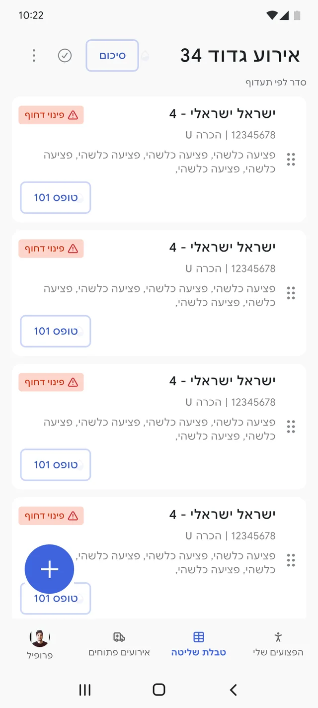
The web side
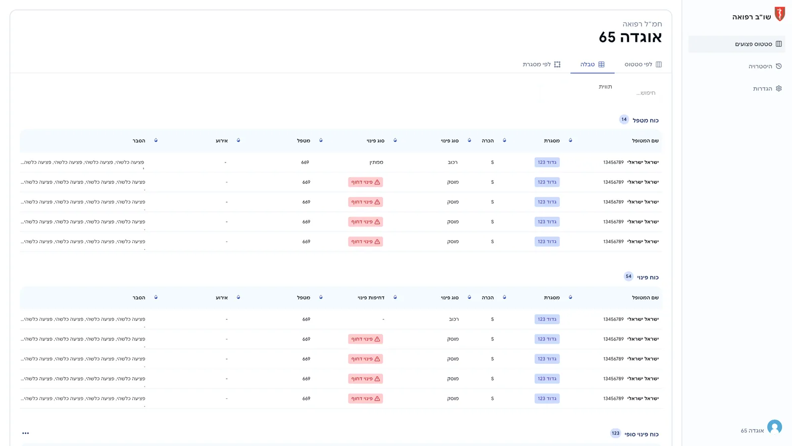
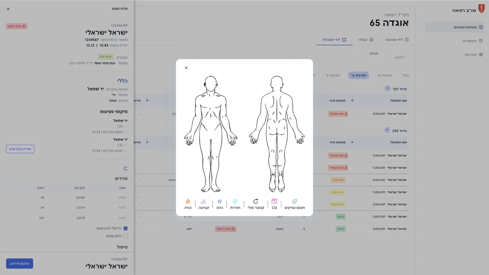
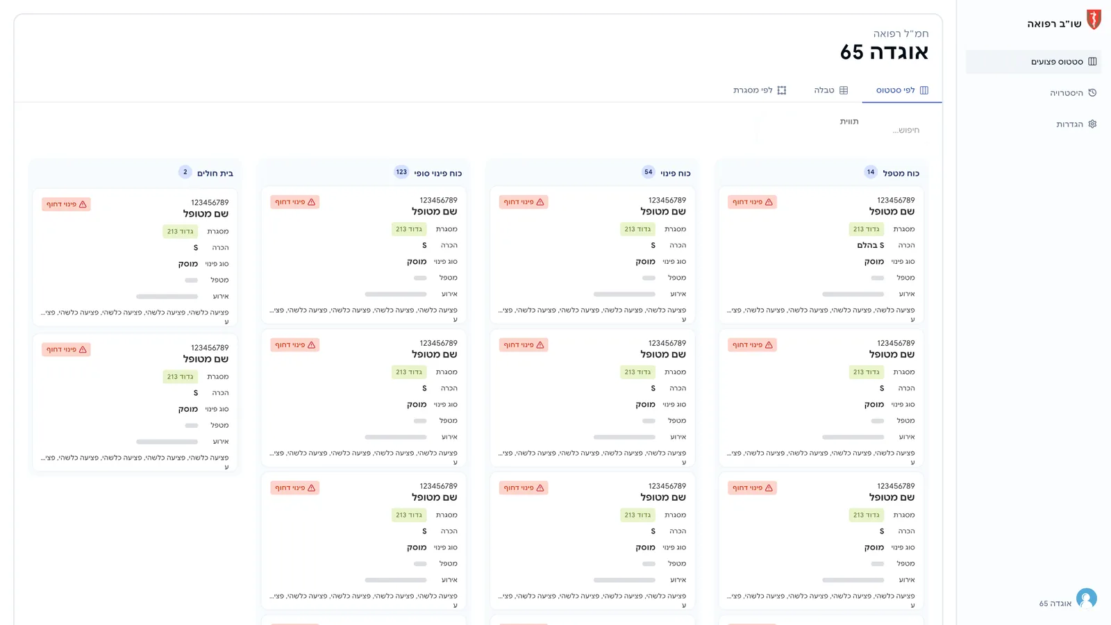
I designed the web views together with the mobile form, so what a medic enters is exactly what the control room reads. Casualties can be viewed by status, by unit or as a table, and each one opens into the full report.
Outcome
16 seconds back to the casualty.Average completion time, about 24% faster.
In a dedicated test run by QA, the average time to complete the operational form dropped from 1:08 to 0:52, about 24% faster. In a medical emergency, those 16 seconds go back to treating the casualty.
What I learned
- Context is a design requirement. Gloves, stress and movement shaped every size and spacing decision.
- Shorter isn't always fewer screens. A scrolling form with compact, sideways options beat splitting the work into more steps.
- Measure it. Having QA time the form before and after turned a design opinion into a result the whole team could see.