
Overview
Kiban started as a question: what happens to a family's wealth in a country where a large part of it still lives on paper? Japan is in the middle of a generational handover of assets, and most of the tools families rely on to manage it are offline, fragmented and hard for heirs to read.
I explored the idea with an AI model as a research partner, then shaped it into a venture of my own. Over a few months I researched the market, defined the product, built the brand, designed the core mobile experience in English and Japanese, and produced tailored pitch materials for Japanese and Taiwanese institutions.
The project hasn't moved forward as a company yet. It is still the clearest picture of how I work when there is no brief, no team and no existing system: find the real problem, make decisions quickly, and build just enough to put it in front of the people who matter.
The problem
Japan is one of the oldest societies in the world, and trillions of yen are passing from one generation to the next. That wealth is tied up in real estate, savings accounts, valuables and complex legal structures. Heirs often don't know what exists, where the documents are, or what the tax bill will be until it is too late to plan.
Analog records
of household financial assets are held in cash and deposits, often tracked in paper passbooks.
Forgotten assets
vacant homes (akiya) across Japan, alongside valuables nobody has appraised.
Tax planning gap
Without early planning, families lose wealth to inheritance tax they could have reduced legally.
Undeclared wealth
Assets that are missed in the filing lead to heavy penalties after the fact.
From this I framed three people the product had to serve: the parents who built the wealth and want to pass it on in order, the heirs who need a clear picture they can act on, and the advisors (tax accountants and lawyers) who do the filing.
The job of the product is to turn a house of paper into a map a family can understand in one glance.
Name and brand
Positioning mattered as much as the interface. In Japan, an "app" reads as something temporary, and this product asks families to trust it with their legacy. So I looked for a name that sounded like infrastructure.
基盤 (Kiban) means foundation or base. Split in two, it tells the product's story: 基 is the root that holds a building up, the founding generation, and 盤 is the board where things happen, the platform for the heirs. Kiban is the thin line that connects them.
The visual direction came from Tadao Ando's exposed concrete: strong, grey, minimal, built to last for generations. That became the brief for the whole identity. Quiet luxury, no decoration, and one deep color that signals trust.
An identity in three decisions
- Phantom Indigo, #060E46. A near-black indigo replaces black across type, icons and primary actions. It reads as serious and financial without the coldness of pure black.
- A soft, solid mark. The logo is a heart turned on its side: at first glance a solid foundation stone, like the name, then a heart, for the care a family passes on.
- Photography of permanence. Architecture, real homes and heirlooms carry the emotion so the interface can stay calm.
The product
I scoped the MVP to four tabs, one for each job the family needs done: see what we own, add what's missing, understand what it will cost, and decide who it goes to.
Assets: the family map
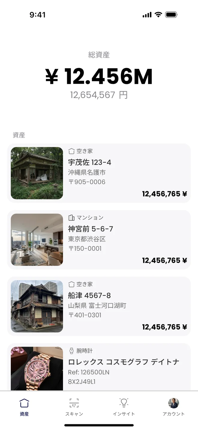
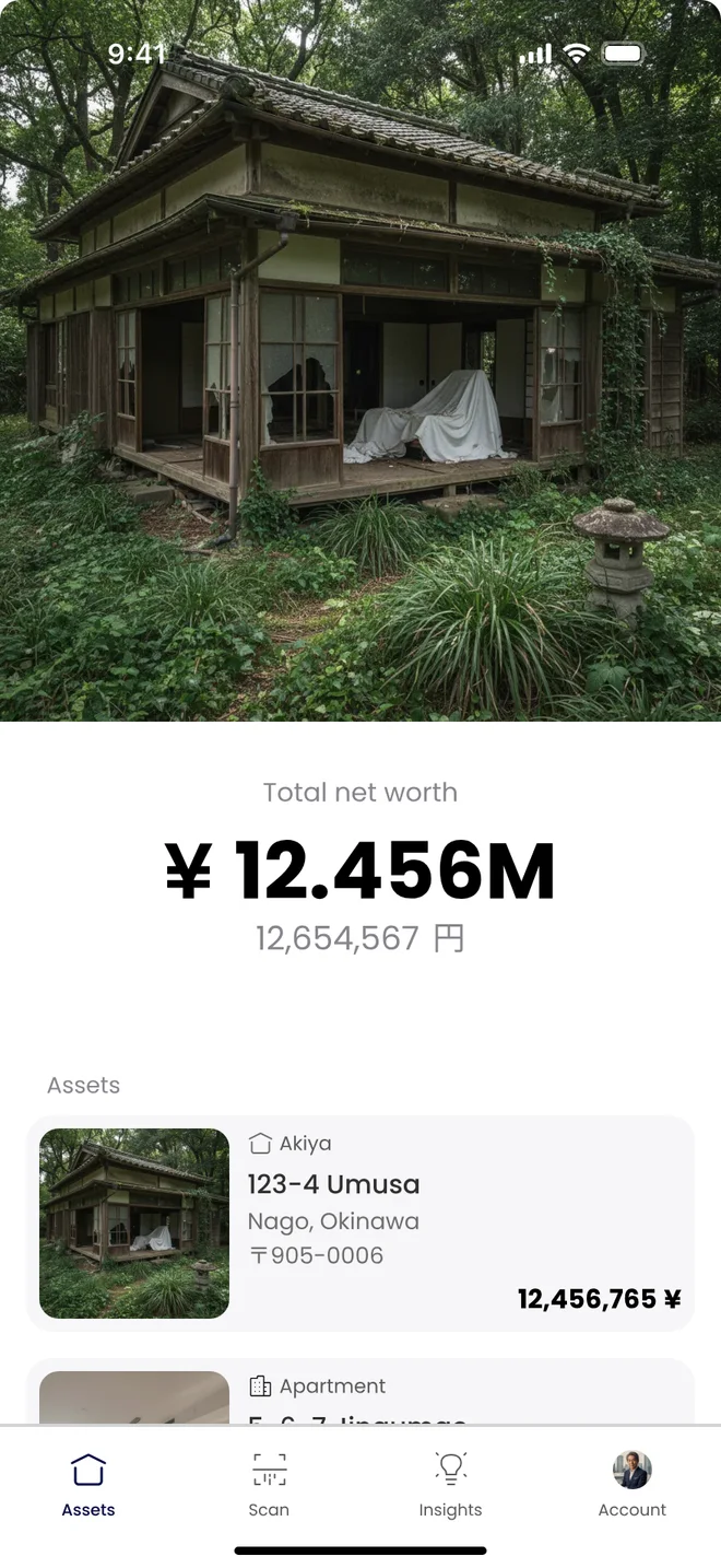
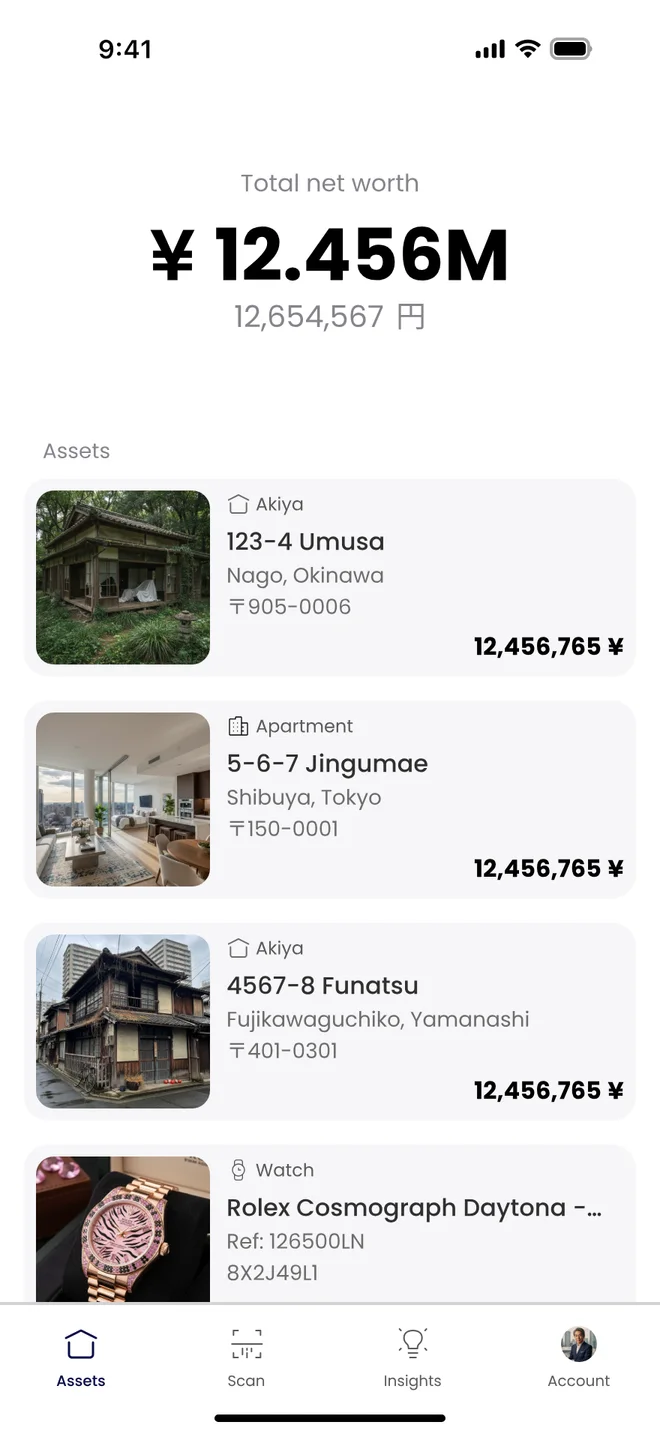
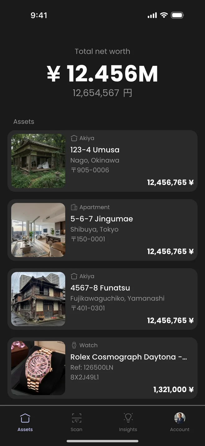
Total net worth sits on top in a short form (¥12.456M) with the exact figure in yen underneath, so both a glance and a precise check are possible. Below it, every asset gets the same card: a photo, its type, a Japanese address with its 〒 postal code, and its value.
Using one card for a rural akiya, a Shibuya apartment, a Rolex and an iDeCo savings account was deliberate. Heirs think in "things we have", not in asset classes, so the list mirrors that.
Scan: from paper to data
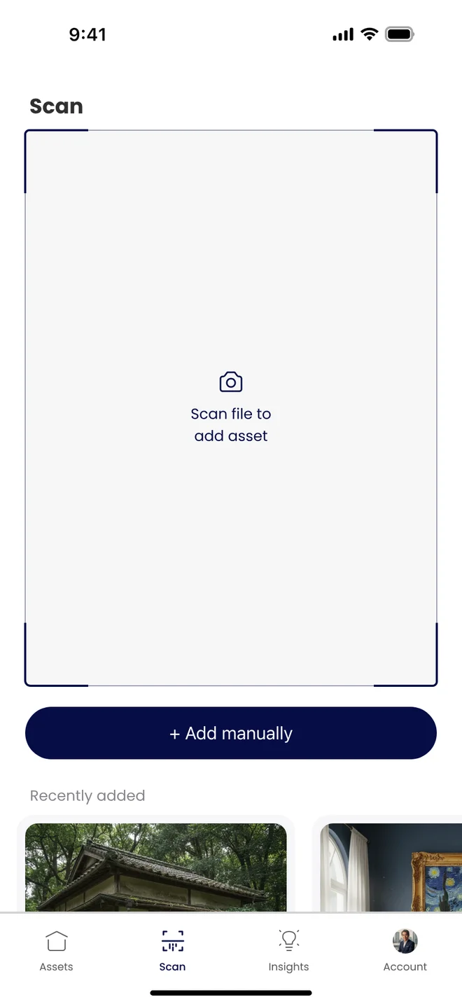
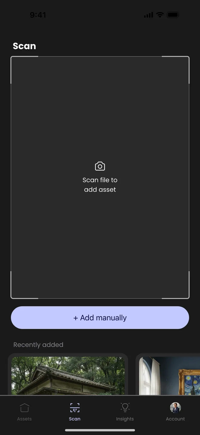
Most of the input is paper: title deeds, tax records, bank passbooks. The scan tab opens on a viewfinder so the first action is simply to point the camera at a document. OCR reads it, classifies it and creates the asset.
"Add manually" sits right under the viewfinder for anything the camera can't capture, and recently added items stay visible so people can confirm the scan worked.
Insights: what it will cost, and what to do
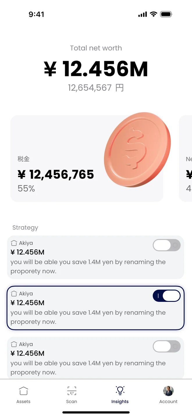
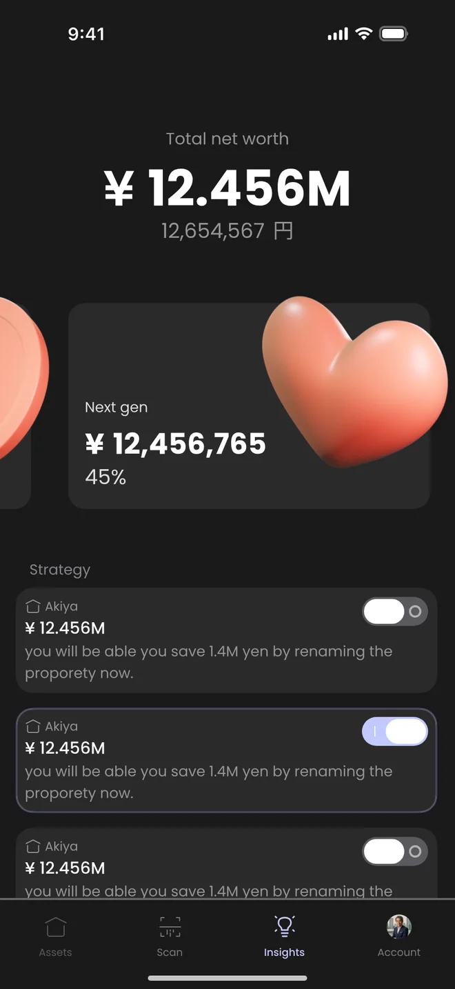
The insights tab answers the question families avoid: how much of this goes to tax, and how much reaches the next generation. A swipeable pair of cards shows the split, and below it each strategy shows the asset, the amount at stake and a plain-language recommendation.
Every strategy has a toggle, so the family can switch it into their plan and see the effect, instead of reading a report they can't act on.
Account: the people behind the assets
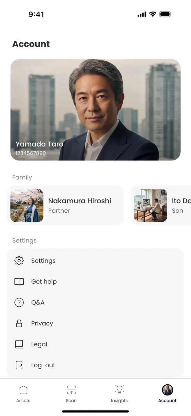
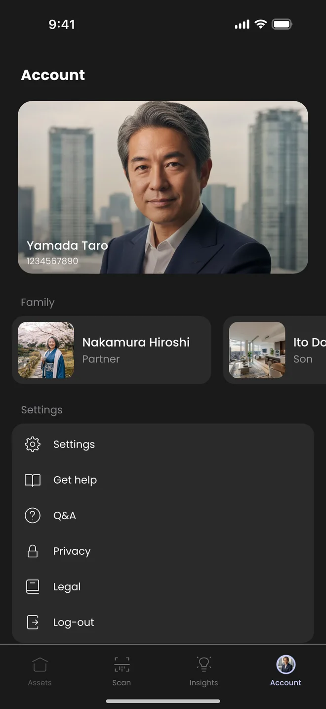
Inheritance is about people, so the account tab leads with the family. Each member has a role (partner, son) that later drives who sees what and who inherits what. Settings, help and legal information sit underneath, out of the way.
Dark mode
Many of the target users read late in the evening or have reduced vision, so every screen was designed in dark mode too. The primary action shifts from indigo to lavender to keep its contrast, and cards lift from the background instead of relying on borders.
Foundations
Even as a team of one, I built Kiban on a small set of shared foundations in Figma, with variables for color and type, so the light, dark and localized versions stay consistent and the screens could later map onto a shared token layer for web and mobile.
| Foundation | Decision | Why |
|---|---|---|
| Typeface | Poppins, 10 to 48 px, in Regular, Medium, SemiBold and Bold | Geometric and legible at small sizes, with clear figures for currency |
| Numbers | 48 px bold for net worth, 16 px bold for asset values | Money is the content, so figures get the strongest weight on every screen |
| Corner radius | 4 for photos inside cards, 16 for cards, 20 for large panels, full for buttons and toggles | Radius signals hierarchy rather than one value everywhere |
| Spacing | A 4 px base, with 4, 8, 12 and 16 doing most of the work | Dense financial data stays readable without feeling cramped |
| Color | Phantom Indigo, Mist surfaces and a grey ramp for text, mirrored for dark mode | One brand color, everything else neutral |
Localization
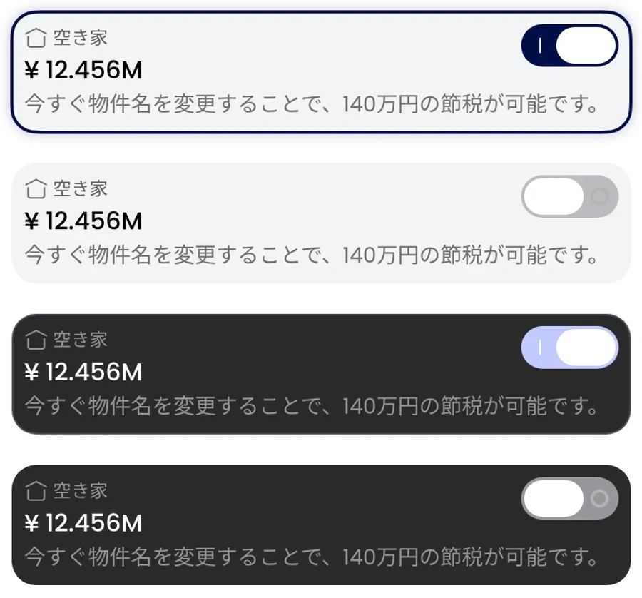
A product about Japanese inheritance has to feel native in Japanese, not translated into it. I designed every screen in English and Japanese side by side, and later adapted the asset view for Taiwan when I explored it as a second market.
What changes between markets
- Currency. Yen totals are shown in millions with the full amount and 円 below. Taiwan switches to NT$ and 元 with the same hierarchy.
- Addresses. Japanese addresses read from prefecture down with the 〒 postal code; Taiwan uses its own district format and postal code label.
- Asset vocabulary. Asset types follow local categories, such as 空き家 (akiya) in Japan and shared land or historic houses in Taiwan.
- Text length. Cards and tab labels are sized for the longest of the three languages, so nothing has to be redesigned per market.
Taking it to market
A regulated product in a foreign market can't launch on design alone. It needs partners, licensing advice and introductions. So I treated the pitch as a design problem too, and designed one-pagers for each organization I approached, in English and in Japanese.
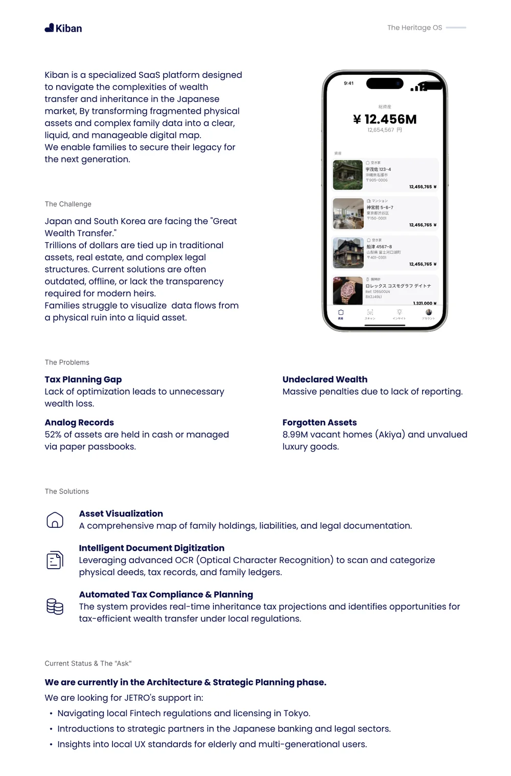
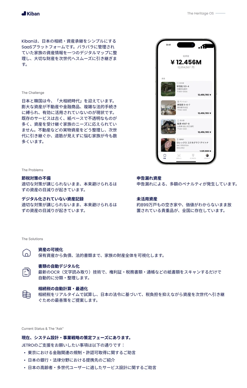

Each version keeps the same structure (challenge, problems, solutions, and a specific ask) but changes the market data and the ask to fit the reader. For JETRO the ask was regulatory guidance and introductions to banking and legal partners in Tokyo; for incubators and funds it was a soft landing and early backing.
- JETROJapan External Trade Organization
- MoneytreeJapanese personal finance platform, about API access to bank account data
- FINOLABTokyo fintech hub
- Samurai IncubateEarly-stage investor
- HIRAC FUNDEarly-stage fund
- TTA and FinTechSpaceTaiwan startup programs
I also mapped fourteen investors and accelerators into four priority tiers in Notion by fit and value-add, and ran the outreach myself. With Moneytree, the conversation was about API access, so Kiban could connect directly to a family's bank accounts instead of relying only on scans. Both meetings gave me direct feedback from people who know the Japanese financial system from the inside.
Outcome
Kiban didn't become a company. A cross-border fintech needs local partners, licensing and capital before it can ship, and the timing wasn't right to commit to all three. I'd still do it again, because it taught me things a single design role rarely does.
What I learned
- In regulated markets, partners come before features. The most useful feedback came from meetings, not from the prototype.
- Trust is a design material. Naming, color, photography and how numbers are shown did as much work as the flows.
- Localization is structure, not translation. Designing in two languages from day one kept the system honest.
- AI speeds up the boring parts. Using AI for research and drafts let me spend my time on decisions.
What I bring to a company
Kiban is what I do when I own the whole problem. I can move from market research to brand to production-ready screens to a pitch deck, decide quickly with incomplete information, and set up just enough system for a product to grow without slowing it down. That's the kind of role I'm looking for next: early, ambitious, and close to the product.